Freedom has today unveiled a refreshed brand identity, marking the next chapter in the company’s growth while reinforcing the values customers already know and trust.
The brand refresh introduces a more modern and confident look for Freedom. It brings together the colours of Freedom’s parent company, Idemitsu Kosan, and the iconic Freedom Tick: a symbol long associated with reliability, convenience and value.
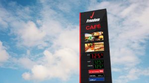


Designed to better reflect the needs of today’s customers, the refreshed Freedom brand represents a sharper focus on delivering everyday savings, dependable service, and making it easier to keep moving.
Freedom Chief Executive Officer, Mark McKenzie said the refresh was about evolving a trusted brand, not changing what customers value most.
“Customers know Freedom for great value, convenience and a straightforward experience.
“This refresh builds on that trust while creating a stronger, more modern brand for the future,” Mark said.
“We know cost of living remains front of mind for many Australians, which is why value continues to sit at the heart of everything we do.”
Customers will begin to see the refreshed Freedom brand roll out across service stations, digital channels, marketing campaigns and customer communications over the coming months and, today, Freedom has launched a brand-new website.
Importantly, while the look is changing, the fundamentals remain the same: competitive pricing, trusted service, and a commitment to local communities.
The refreshed brand will also support Freedom’s continued investment in growth, customer value and digital experiences.
Freedom is a state of mind. And we’re locked in.